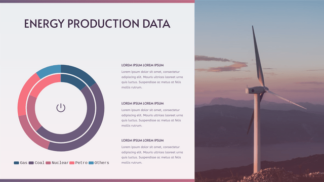
Double Doughnut Charts, also known as comparative Doughnut Charts, are a powerful tool for visualizing hierarchical data in a circular format. They allow viewers to compare two datasets side by side, making it easier to identify patterns and relationships. This tutorial will guide you through the key concepts of Double Doughnut Charts, provide a realistic example, and show you how to implement it using Visual Paradigm Online‘s Chart Tool.
Key Concepts
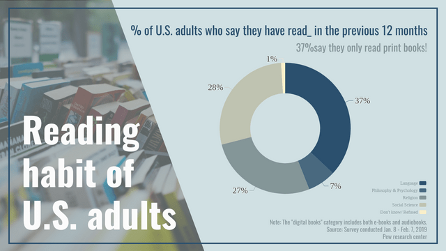
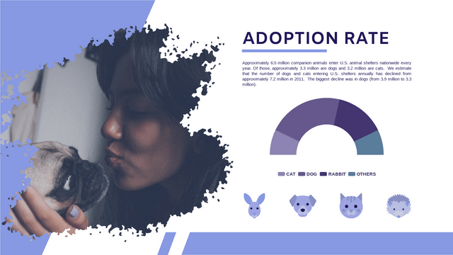
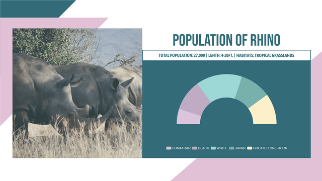
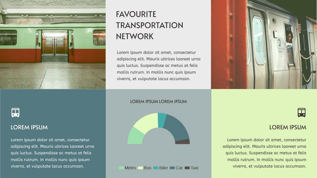
Doughnut Chart: A doughnut chart is a variation of a pie chart where the center is cut out. This design allows for additional information to be displayed in the center, making it more versatile than a traditional pie chart.
Double Doughnut Chart: This chart consists of two concentric doughnut charts, usually representing two related datasets. It enables comparisons between the two datasets, making it easier to identify patterns and relationships.
Use Cases
Double Doughnut Charts are excellent for:
- Comparing Two Related Categories: Visualize the relationship between two related datasets.
- Showing Distribution of a Whole into Parts: Illustrate how a whole is divided into parts for two different datasets.
- Visualizing Demographic Data, Budget Allocations, or Survey Results: Effectively present data in a way that highlights comparisons and trends.
Example Scenario
Let’s consider a company that wants to visualize its sales and expenses across different departments. We will create a Double Doughnut Chart to compare sales and expenses in three departments: Marketing, Sales, and Development.
Data Structure
Here’s the sample data we will use:
Sales Data:
- Marketing: $50,000
- Sales: $70,000
- Development: $30,000
Expense Data:
- Marketing: $30,000
- Sales: $50,000
- Development: $20,000
Implementing a Double Doughnut Chart with Visual Paradigm Online
Description of the Double Doughnut Chart
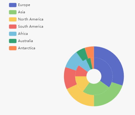
The comparative doughnut chart visualizes sales data by continent for the years 2018 and 2020. This chart effectively highlights changes in sales distribution across different regions over the specified period.
Outer Doughnut (2018): The outer ring represents the sales figures for each continent in 2018. Each segment’s size corresponds to the proportion of total sales attributed to that continent, allowing for quick visual comparisons.
Inner Doughnut (2020): The inner ring illustrates the sales figures for 2020. Similar to the outer doughnut, the size of each segment reflects the sales contribution from each continent, enabling viewers to see how sales have shifted over the two years.
Key Insights:
- Growth in Europe and Asia: Both Europe and Asia show an increase in sales from 2018 to 2020.
- Decline in North America: North America experienced a decrease in sales during the same period.
- Stable Sales in Africa and Australia: Sales in Africa and Australia showed only minor changes, indicating relative stability.
This chart serves as a powerful tool for analyzing trends in global sales, helping stakeholders make informed decisions based on regional performance over the specified years.
Here’s the data for the comparative doughnut chart presented in table form:
| Continent | Sales (2018) | Sales (2020) |
|---|---|---|
| Europe | 30 | 35 |
| Asia | 20 | 25 |
| North America | 18 | 15 |
| South America | 12 | 10 |
| Africa | 10 | 8 |
| Australia | 5 | 4 |
| Antarctica | 5 | 3 |
This table summarizes the sales data by continent for the years 2018 and 2020.
Step-by-Step Guide to Creating a Double Doughnut Chart
- Log In to Visual Paradigm Online: Access your Visual Paradigm Online account.
- Create a New Chart: Click on “Create New” and select “Double Doughnut Chart.”
- Input Data: Enter the sales and expense data for each department. You can manually input the data or import it from a spreadsheet.
- Customize Your Chart:
- Labels: Add labels for each segment to clearly identify the departments and their corresponding sales and expense data.
- Colors: Choose distinct colors for each segment to make the chart visually appealing and easy to read.
- Legend: Include a legend to explain what each color represents.
- Center Information: Utilize the center of the doughnut chart to display additional information, such as total sales or expenses.
- Review the Chart: Ensure that the chart accurately represents the data and makes the comparisons clear.
- Save and Share: Save your chart and share it with your team or include it in your presentations.
Example Implementation
Let’s walk through the steps to create a Double Doughnut Chart for the company’s sales and expenses data.
- Select Double Doughnut Chart: Choose the Double Doughnut Chart option from the Visual Paradigm Online dashboard.
- Input Data:
- Sales Data:
- Marketing: $50,000
- Sales: $70,000
- Development: $30,000
- Expense Data:
- Marketing: $30,000
- Sales: $50,000
- Development: $20,000
- Sales Data:
- Customize:
- Labels: Add labels for Marketing, Sales, and Development.
- Colors: Choose different colors for sales and expenses to distinguish between the two datasets.
- Legend: Include a legend to explain the colors.
- Center Information: Display the total sales and expenses in the center.
- Review: Check the chart to ensure it accurately represents the data.
- Save and Share: Save the chart and share it with stakeholders.
Conclusion
Double Doughnut Charts are a powerful tool for visualizing and comparing two related datasets. With Visual Paradigm Online, creating and customizing these charts is easy and intuitive. Whether you’re comparing sales and expenses, visualizing demographic data, or analyzing survey results, Double Doughnut Charts offer a comprehensive and visually appealing way to present your data. Start creating your Double Doughnut Charts today and unlock the power of data visualization!
For more inspiration and templates, visit the Visual Paradigm Chart Templates page. Explore a range of chart types, learn how to customize them, and gain insights into best practices for data visualization.


