In the world of data visualization, selecting the appropriate chart type is crucial for effectively communicating insights. Two commonly used chart types are the Doughnut Chart and the Grouped Column Chart. Each has its own advantages, disadvantages, and ideal use cases. This article will explore the strengths and weaknesses of both chart types, provide realistic examples, and guide you in choosing the right chart for your data.
Advantages and Disadvantages
Doughnut Chart
Advantages:
- Part-to-Whole Relationships: Doughnut charts excel at showing how parts contribute to a whole, making them ideal for displaying market share, budget breakdowns, and other scenarios where proportional representation is key.
- Visual Appeal: They are visually engaging and easy to understand, making them a popular choice for presentations and reports.
Disadvantages:
- Limited Comparisons: Doughnut charts are less effective for comparing multiple categories across different groups or time periods.
- Space Constraints: They can become cluttered if there are too many categories, especially on smaller screens.
Grouped Column Chart
Advantages:
- Direct Comparison: Grouped column charts allow for easy comparison of multiple categories across different groups, making it clear which category performs better.
- Exact Values: The vertical bars make it easier to read and interpret exact values, providing a clear representation of data.
- Clear Trends: These charts can effectively represent trends over categories or time, making them ideal for analyzing performance metrics.
Disadvantages:
- Space Constraints: Can become cluttered if there are too many categories or groups, especially on smaller screens.
- Less Visually Appealing: May not be as visually engaging as a doughnut chart for some audiences.
Use Cases
Doughnut Chart:
- Best For: Displaying market share, budget breakdowns, or any scenario where you want to show how parts contribute to a whole.
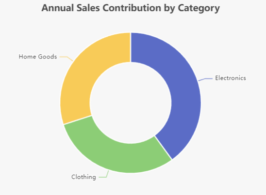
- Example: Visualizing the overall contribution of each product category to total sales for the year.
Grouped Column Chart:
- Best For: Comparing performance metrics across different categories, such as sales by region or product performance over time.
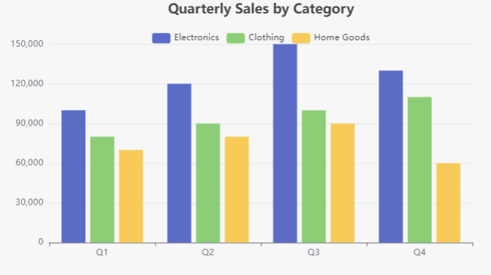
- Example: Comparing quarterly sales across different product categories to highlight trends and variations.
Choosing the Right Chart
Choosing between a doughnut chart and a grouped column chart depends on the data you want to present and the story you wish to tell. For part-to-whole relationships, a doughnut chart may be more effective. For comparative analysis, a grouped column chart is often the better choice.
Example Scenario: Annual Sales Data for a Retail Company
Data Context: A retail company sells three product categories: Electronics, Clothing, and Home Goods. The company wants to analyze its sales performance for the year across different quarters.
1. Doughnut Chart Example
Purpose: To show the proportion of total sales contributed by each product category for the entire year.
Data:
- Total Sales: $1,000,000
- Electronics: $400,000 (40%)
- Clothing: $300,000 (30%)
- Home Goods: $300,000 (30%)
Doughnut Chart: The chart will visually display the slices representing each category’s contribution to the total sales, helping stakeholders quickly understand which categories are performing best.
2. Grouped Column Chart Example

Purpose: To compare quarterly sales across the three product categories.
Data:
- Quarter 1:
- Electronics: $100,000
- Clothing: $80,000
- Home Goods: $70,000
- Quarter 2:
- Electronics: $120,000
- Clothing: $90,000
- Home Goods: $80,000
- Quarter 3:
- Electronics: $150,000
- Clothing: $100,000
- Home Goods: $90,000
- Quarter 4:
- Electronics: $130,000
- Clothing: $110,000
- Home Goods: $60,000
Grouped Column Chart: Each quarter will have a set of three columns (one for each product category), allowing for direct comparison of sales performance across quarters and categories.

Conclusion
Doughnut Chart: Best for visualizing the overall contribution of each product category to total sales for the year.
Grouped Column Chart: Best for comparing how each product category performed across different quarters, highlighting trends and variations in sales.
By understanding the advantages, disadvantages, and ideal use cases of doughnut charts and grouped column charts, you can make informed decisions about which chart type to use for your data visualization needs. Whether you are displaying part-to-whole relationships or conducting comparative analysis, choosing the right chart will enhance the clarity and impact of your data presentation.
Learn More about Doughnut Chart
This post is also available in Deutsch, Español, فارسی, Français, English, Bahasa Indonesia, 日本語, Polski, Portuguese, Ру́сский, Việt Nam, 简体中文 and 繁體中文.


