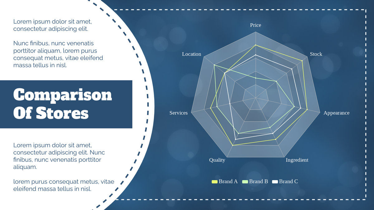
Radar charts, also known as spider charts or web charts, are powerful tools for visualizing multivariate data. They allow you to compare multiple variables simultaneously, making them ideal for comparative analysis, performance evaluation, and skill assessment. Visual Paradigm Online offers a user-friendly platform to create stunning radar charts. This tutorial will guide you through the process of creating and customizing radar charts to unlock deeper insights from your data.

What is a Radar Chart?
A radar chart is a graphical representation of multivariate data. Each axis represents a different variable, and the values for each variable are plotted along the axes, forming a polygon. This visualization method is particularly effective for comparing multiple items across several variables.

When to Use a Radar Chart
Radar charts are especially useful in the following scenarios:
- Comparative Analysis: Compare multiple items across several variables, such as comparing different products based on features like price, quality, and durability.
- Performance Evaluation: Assess the performance of different entities (e.g., products, teams, or individuals) based on various criteria.
- Skill Assessment: Visualize skill levels in different areas for individuals or groups, commonly used in educational settings.
Getting Started with Visual Paradigm Online
- Log In: Access your Visual Paradigm Online account.
- Create a New Chart: Click on “Create New” and select “Radar Chart.”
- Input Data: Enter your data into the provided fields. You can manually input data or import it from a spreadsheet.
- Customize Your Chart: Use the customization tools to adjust the chart’s appearance, including colors, labels, and segment sizes.
- Save and Share: Save your chart and share it with your team or include it in your presentations.
Step-by-Step Guide to Creating Radar Charts
Let’s walk through some practical examples to understand how to create and customize radar charts using Visual Paradigm Online.
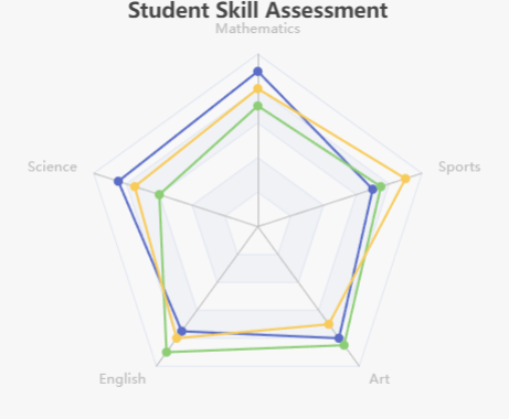
Example 1: Student Skill Assessment

Dataset: This radar chart evaluates three students across five skills: Mathematics, Science, English, Art, and Sports.
| Skill | Alice | Bob | Charlie |
|---|---|---|---|
| Mathematics | 90 | 70 | 80 |
| Science | 85 | 60 | 75 |
| English | 75 | 90 | 80 |
| Art | 80 | 85 | 70 |
| Sports | 70 | 75 | 90 |
Steps:
- Select Radar Chart: Choose the radar chart option from the Visual Paradigm Online dashboard.
- Input Data: Enter the skill data for each student.
- Customize: Adjust the labels, colors, and other visual elements to fit your preferences.
- Review: Check the chart to ensure it accurately represents the data.
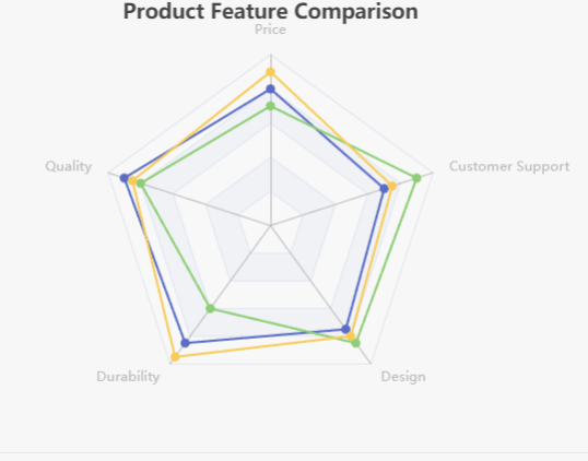
Example 2: Product Feature Comparison

Dataset: This radar chart compares three products based on five features: Price, Quality, Durability, Design, and Customer Support.
| Feature | Product A | Product B | Product C |
|---|---|---|---|
| Price | 80 | 70 | 90 |
| Quality | 90 | 80 | 85 |
| Durability | 85 | 60 | 95 |
| Design | 75 | 85 | 80 |
| Customer Support | 70 | 90 | 75 |
Steps:
- Select Radar Chart: Choose the radar chart option from the Visual Paradigm Online dashboard.
- Input Data: Enter the feature data for each product.
- Customize: Adjust the labels, colors, and other visual elements to fit your preferences.
- Review: Check the chart to ensure it accurately represents the data.
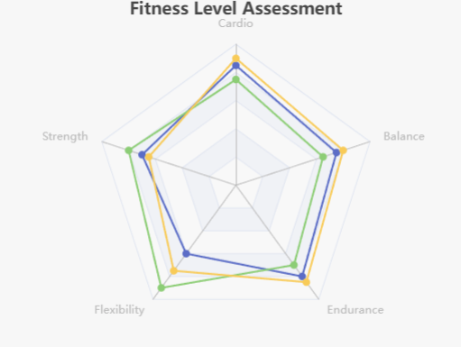
Example 3: Fitness Level Assessment

Dataset: This radar chart assesses the fitness levels of three individuals across five activities: Cardio, Strength, Flexibility, Endurance, and Balance.
| Activity | John | Sarah | Mike |
|---|---|---|---|
| Cardio | 85 | 75 | 90 |
| Strength | 70 | 80 | 65 |
| Flexibility | 60 | 90 | 75 |
| Endurance | 80 | 70 | 85 |
| Balance | 75 | 65 | 80 |
Steps:
- Select Radar Chart: Choose the radar chart option from the Visual Paradigm Online dashboard.
- Input Data: Enter the fitness data for each individual.
- Customize: Adjust the labels, colors, and other visual elements to fit your preferences.
- Review: Check the chart to ensure it accurately represents the data.
Exploring Radar Chart Templates
Visual Paradigm Online offers a variety of radar chart templates to help you get started. These templates can serve as inspiration for your own projects and provide a foundation for customization.
Why Use Visual Paradigm Chart Templates?
- Diverse Options: Explore a range of chart types to suit various data visualization needs.
- Customization: Learn how to customize templates to better fit your specific requirements.
- Best Practices: Gain insights into best practices for data visualization.
- Practical Examples: Use real-world examples as a basis for your projects.
How to Get Started with Templates
- Visit the Website: Check out the Visual Paradigm Chart Templates here.
- Explore Templates: Browse through the various chart templates available.
- Experiment: Download templates and practice customizing them to get hands-on experience in data visualization.
By leveraging these resources, you can deepen your understanding of chart design and improve your ability to communicate data effectively.
Conclusion
Radar charts are a powerful tool for visualizing multivariate data. With Visual Paradigm Online, creating and customizing radar charts is easy and intuitive. Whether you’re comparing products, evaluating performance, or assessing skills, radar charts offer a comprehensive and visually appealing way to analyze your data. Start creating your radar charts today and unlock the power of data visualization!

