In today’s data-driven world, effective data visualization is crucial for making informed decisions. Visual Paradigm Online offers a powerful chart tool with a variety of templates designed to enhance your ability to visualize data effectively. This tutorial will guide you through the different chart types available, their use cases, and how to create and customize these charts using Visual Paradigm Online.

Why Choose Visual Paradigm Online’s Chart Tool?
Visual Paradigm Online provides a user-friendly platform with a wide range of chart templates that cater to various data visualization needs. Whether you’re analyzing market share, comparing sales performance, or evaluating performance metrics, Visual Paradigm has the right chart for you.
Types of Charts and Their Use Cases
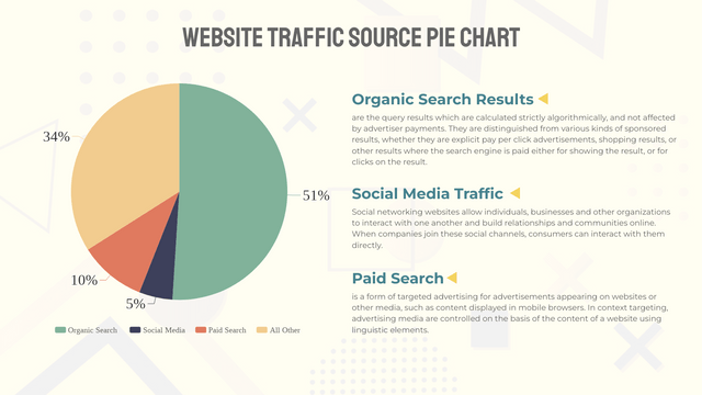
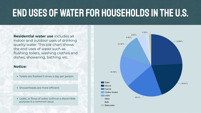
1. Pie Chart
Use Case: Market Share Analysis
- Description: A pie chart can illustrate the market share of different companies within an industry. Each slice represents a company’s share, making it easy to compare their relative sizes.
- Example: Visualize the market share of different smartphone manufacturers to understand their dominance in the market.
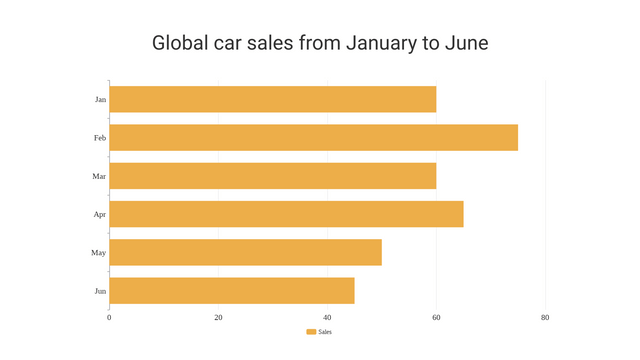
2. Bar Chart
Use Case: Sales Performance Comparison
- Description: A bar chart can be used to compare sales performance across different products or regions. Each bar represents a product or region, allowing for straightforward comparison of sales figures.
- Example: Compare the sales performance of different product categories (e.g., electronics, clothing, home goods) across various regions.
3. Line Chart
Use Case: Trend Analysis over Time
- Description: A line chart is ideal for showing trends over time, such as monthly sales figures over several years. Each line can represent a different product or region, making it easy to identify trends and patterns.
- Example: Analyze the monthly sales trends of a company over the past five years to identify seasonal patterns and overall growth.
4. Stacked Bar Chart
Use Case: Cumulative Sales Analysis
- Description: A stacked bar chart can show the cumulative sales for different products across various regions. Each segment of the bar represents a product’s contribution to total sales, allowing for a clear visualization of how each product performs.
- Example: Visualize the cumulative sales of different product lines (e.g., smartphones, laptops, tablets) across different regions to understand their overall performance.
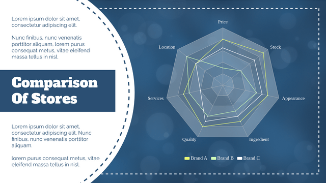
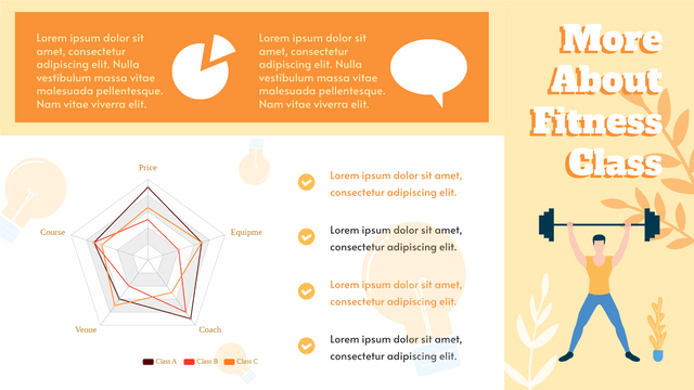
5. Radar Chart
Use Case: Performance Evaluation
- Description: A radar chart can be utilized to evaluate multiple performance metrics for different teams or departments. Each axis represents a different metric, providing a comprehensive view of strengths and weaknesses.
- Example: Evaluate the performance of different sales teams based on metrics such as customer satisfaction, sales volume, and lead conversion rate.
6. Donut Chart
Use Case: Budget Allocation
- Description: A donut chart is effective for visualizing budget allocations across various departments. The central space can be used for additional information, such as total budget or a key metric.
- Example: Display the budget allocation for different departments (e.g., marketing, R&D, operations) within a company, with the total budget shown in the center.
7. Bubble Chart
Use Case: Market Size and Growth
- Description: A bubble chart can depict the relationship between market size, growth rate, and market share for different companies. Each bubble’s size represents market size, while its position reflects growth and share.
- Example: Analyze the market size, growth rate, and market share of different companies in the tech industry to identify key players and emerging trends.
Using Visual Paradigm Templates
Creating charts with Visual Paradigm Online is a straightforward process. Follow these steps to create and customize your charts:
Step 1: Select a Template
- Choose the appropriate chart template from the Visual Paradigm library based on your data visualization needs.
Step 2: Input Data
- Enter your data into the template, ensuring that it is organized correctly for the chart type you have selected.
Step 3: Customize Design
- Modify colors, labels, and other design elements to enhance readability and visual appeal. Customize the chart to match your brand or presentation style.
Step 4: Analyze and Share
- Utilize the chart for presentations or reports, making data-driven decisions easier for stakeholders. Share your insights effectively with visually appealing and informative charts.
Step-by-Step Guide to Creating Charts
Example: Creating a Pie Chart for Market Share Analysis
- Select a Template:
- Log in to Visual Paradigm Online and navigate to the chart templates library.
- Choose the pie chart template designed for market share analysis.
- Input Data:
- Open the template and enter your market share data for different companies. Ensure that each slice represents a company’s share accurately.
- Customize Design:
- Modify the colors of each slice to differentiate between companies.
- Add labels to each slice to indicate the company name and market share percentage.
- Customize the chart title and legend to provide context.
- Analyze and Share:
- Review the pie chart to ensure it accurately represents the market share data.
- Use the chart in presentations or reports to communicate market share insights to stakeholders.
Conclusion
Visual Paradigm Online’s chart tool offers a comprehensive and user-friendly solution for creating a wide range of charts. By selecting the right chart type for your data visualization needs and customizing it to enhance readability and visual appeal, you can effectively communicate data insights to stakeholders. Whether you’re analyzing market share, comparing sales performance, or evaluating performance metrics, Visual Paradigm has the tools you need to create stunning and informative charts.
Start using Visual Paradigm Online’s chart tool today and elevate your data visualization game!
This post is also available in Deutsch, Español, فارسی, Français, English, Bahasa Indonesia, 日本語, Polski, Portuguese, Ру́сский, Việt Nam, 简体中文 and 繁體中文.


